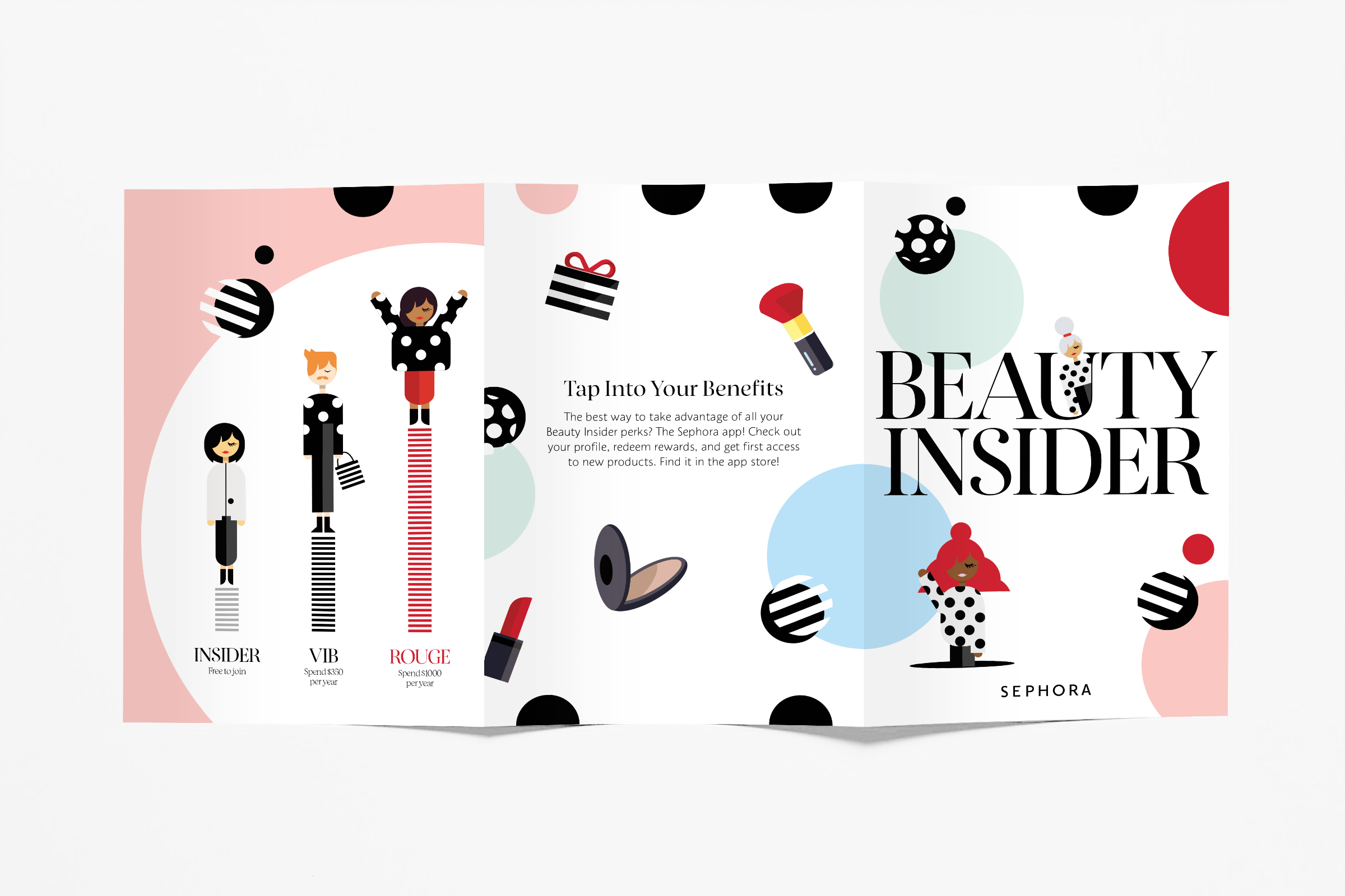
Branding / Art Direction

BeautyINSIDER Brand Refresh

Sephora
@San Francisco


The task is to create a compelling branding style to recruit new customers to join the Beauty Insider program and increase sales.

Sephora believes that everyone deserves something beautiful. Our solution is to create a Beauty Insider happy place and welcome everyone to join the place. For the visual language, the design added in some different colors, patterned dots, and BI girl illustrations with different body shapes and genders to represent the diversity of each individual. And the total look and feel give customers a warm welcome to the new beauty insider program. The design assets expanded across all Sephora channels including sephora.com, the Sephora app, digital, print, paid social, and in-store experiences.

Introducing the New BeautyINSIDER

The campaign website is the first approach to our customers with a celebratory look-and-feel to introduce that Sephora has launched the new BeautyINSIDER program. We know more beauty = more happiness, and we would like to make Sephora your happy place.

Sephora desktop landing copy.png


The new design look applied to both digital and print work including e-mail, IG posts, IG stories, banners, and in-store booklet. Below are e-mail examples with three wavies, and for each of the wavies it targets different customer tiers.


Comp 1.gif
IGS2.jpg
mucups-10-.png
mucups-1&2.png
mucups-04-.png
 

COVID-19 Store re-open

The mission is to announce Sephora stores are re-open to the public during COVID-19 and give welcome back discounts to customers. The visual has expanded based on the BeautyINSIDER relaunch guideline and the use of balloons as the main element to convey a celebratory moment.

Previous
Previous

Apple

Next
Next

Hennessy Voice Art Campaign|Mobile Experience